Pie Chart
Mermaid Pie Chart Syntax
A pie chart is a circular chart divided into slices, where the size of each slice is proportional to the value it represents relative to the whole. It is the classic way to show how a total breaks down into parts, such as market share or a budget split.
One label and one number per line is the whole format. Mermaid works out the percentages and draws the slices, so the chart lives in your source file rather than a spreadsheet.
Last updated: · Mermaid v11
Try it live
When to use pie chart
Data reporting
Embed proportion charts in technical documentation, READMEs, and reports without leaving your editor. Values can be raw counts — Mermaid derives the percentages and keeps the chart honest.
Market analysis
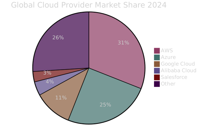
Visualize market share, survey results, and percentage breakdowns from a few lines of text. When the numbers change, editing one value re-renders the chart everywhere the snippet lives.
Resource allocation
Show how time, budget, or capacity splits across categories in a form that survives copy-paste into any Mermaid-aware tool — GitHub, GitLab, Notion, or your wiki.
Key syntax
pieDeclare pie charttitle My ChartOptional chart title"Label" : valueData slice (numeric value)showDataShow values in legendHow to create a pie chart with Mermaid
Open FlowViz and type pie on the first line.
Optionally add a title: title My Chart Title.
Add data slices: "Label Name" : numeric_value.
Add as many slices as needed — Mermaid handles the math.
Optionally add showData to display values in the legend.
Export as SVG for use in documents or presentations.
Frequently asked questions
Can I control the colour of each slice?
Not per slice in the syntax itself. Mermaid assigns slice colours from the active theme, in the order the slices are declared, so reordering the data reassigns the colours. To pin specific colours, either override the theme variables with an init block at the top of the diagram, or export the SVG and set the fills there — the export is plain SVG, so the slices are ordinary editable paths.
What is a Mermaid pie chart used for?
Quick proportion breakdowns — budget splits, market share, survey results — defined entirely in text.
How do I add slices to the pie?
One line per slice: "Label" : value. Mermaid computes the percentages from the raw values.
Can I show the values on the chart?
Yes — declare pie showData and the raw values render next to each label.
Related tools
Start diagramming now
No signup. No install. Just open the editor and start writing.